Context
Alter Domus, a global financial services company, wanted to unify the design across internally built and newly acquired products through the implementation of design tokens. Once the Design Systems expert standardized the foundation, I ensured everything was implemented consistently and as intended.
Workflow
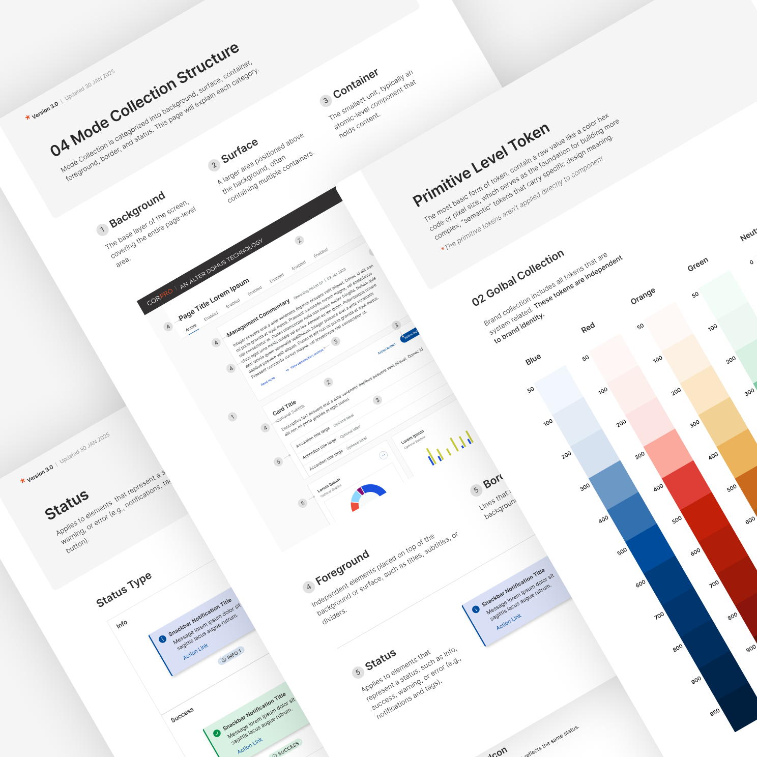
1. Use Figma Components and Tokenize Design System
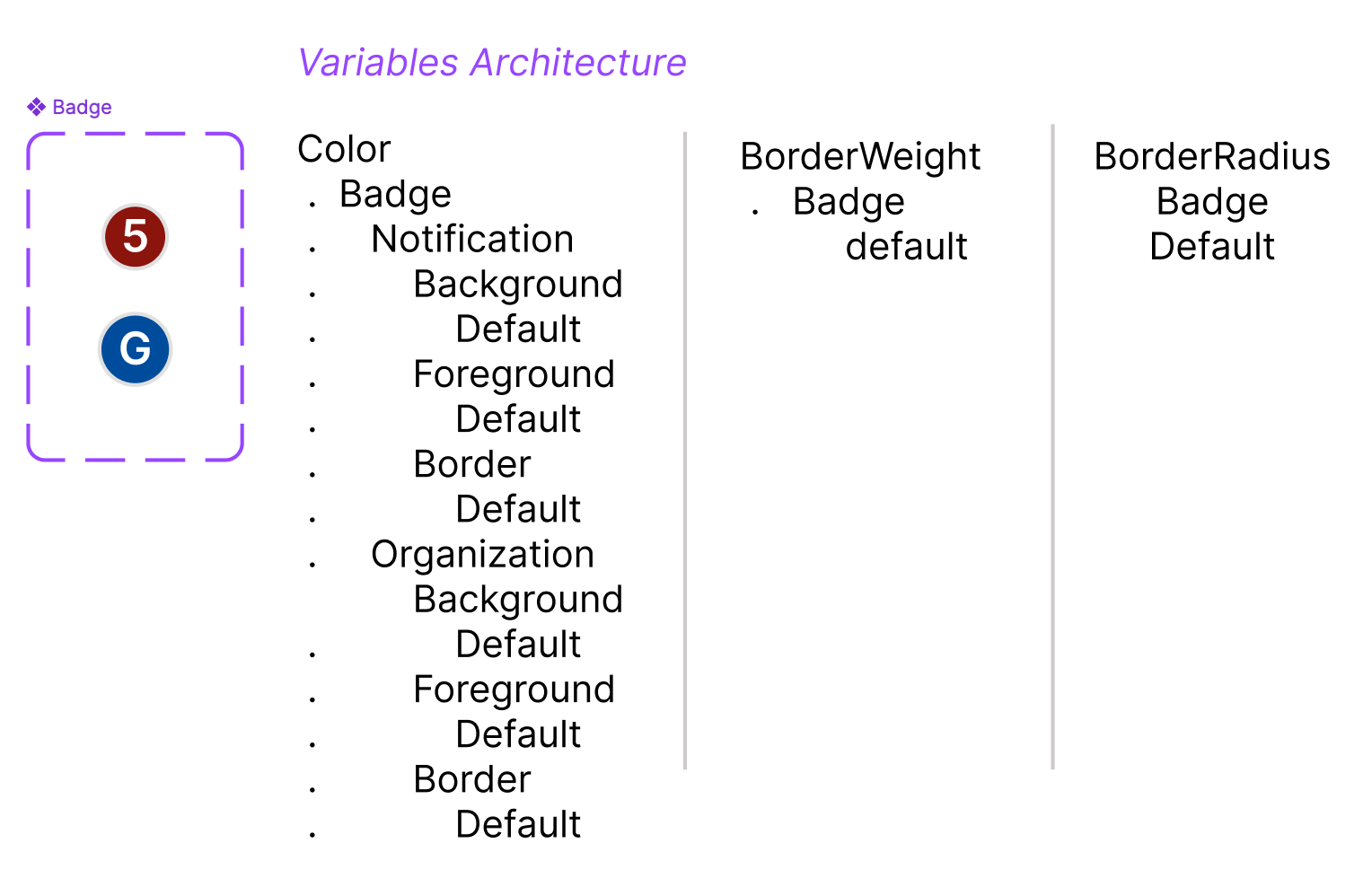
Taking the DSM foundations file,
applied the typography styles and
design tokens across all
components. Meanwhile, we also
audited existing components
to ensure accessibility, consistent
spacing, and atomic structure.
2. Implement Design System in Storybook
Taking the Foundations and Components
file, the Development team implemented
the components to be a hosted design
system in Storybook. This allows any and
all applications Alter Domus builds to
utilize the same component library
hosted in Storybook.
Creative QA
Verify that design components are implemented as intended, review responsiveness and consistency, ensure visual details and give feedback for technical accuracy and creative quality for a pixel-perfect client.
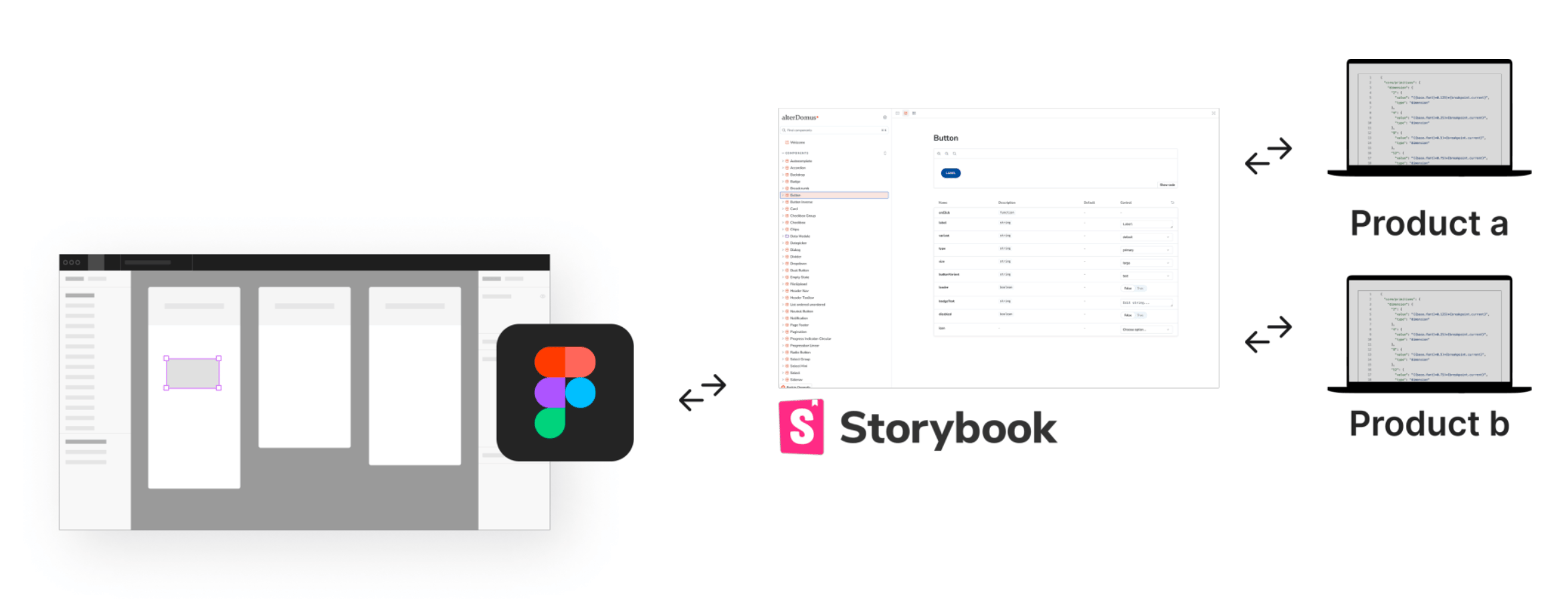
Design System to Development: Figma + Storybook = Product
Taking the Foundations and Components file, Development team implemented the components to be a hosted design system in Storybook.
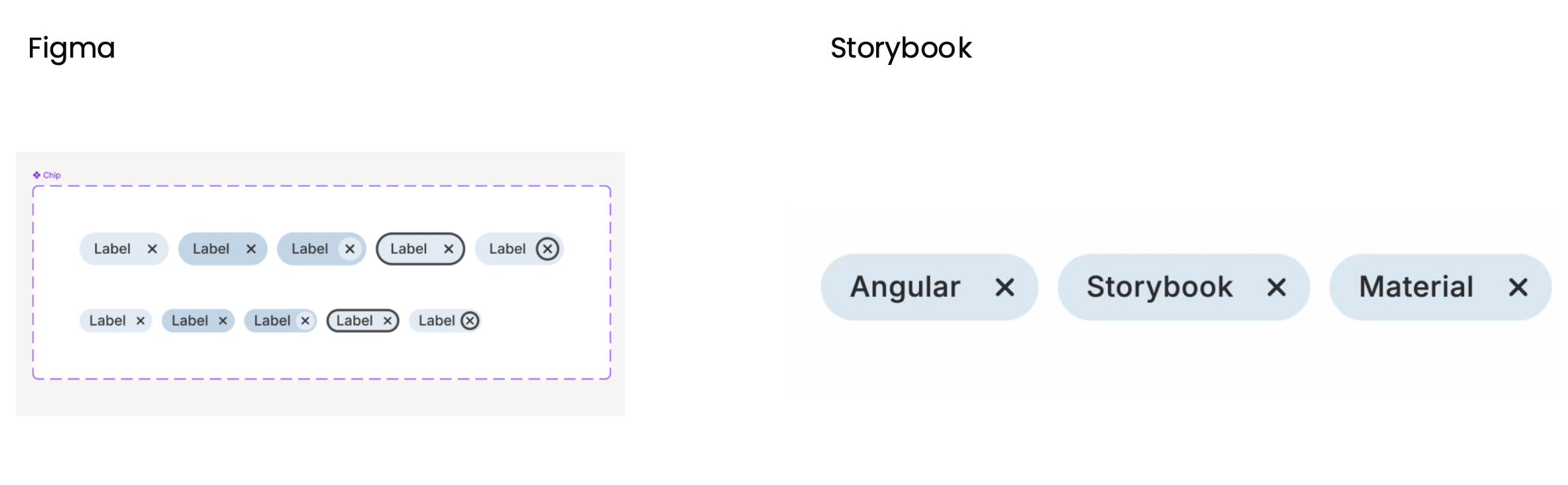
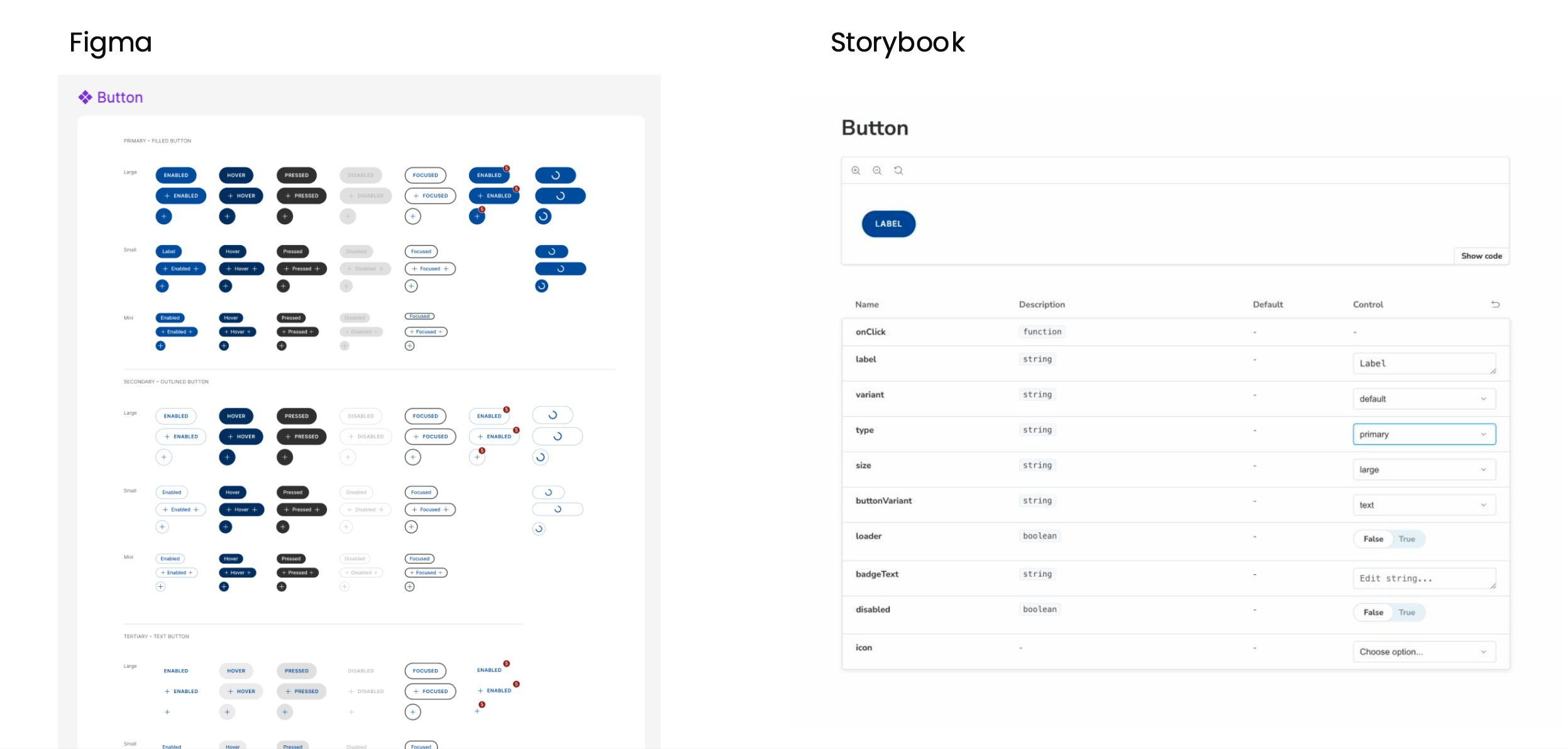
I ensured that the components were implemented according to the design, provided feedback to developers, and handled the handoff to the client.